Introduction
Having good website navigation is very important so that you can browse your website easily. When your website navigation is user-friendly, people spend more time on your website and understand your services better. In this blog post, we’ll discuss the best practices for website navigation. We’ll look at how you can keep your website menus clean and easy to navigate, why responsive design is important for mobile users, and how you can improve your website navigation to provide a better user experience.
Let’s start by knowing what principles we can keep in mind to improve your website’s navigation.
Clear and Intuitive Menu Structure
Website menu structure is very important so that people do not get confused while visiting your website. Here are some tips that may help you:
Setting Up Content Categories:
Divide your website topics into groups. such as “services,” “products,” or “blogs.” Keep related topics together so it’s easy for users to find them.
Maintaining Hierarchy in Logic:
Organize your menu in a way that is easy for customers to understand. Distinguish between main menus and submenus, so everything has its place. Before using drop-down menus, understand how to use them.
Responsive Design for Mobile Users:
Taking care of mobile users is very important. Make the menu mobile-friendly for them.
Use hamburger menus, but remember that some users take a while to understand them. Alternatives should also be used.
Improve Through Testing:
Test your menu layout and see how users interact. Use simple user feedback methods to help improve your menu.
By following these tips, you can make your website’s menu clean and easy to understand. This will make it easier for users to navigate your website and find the information they need faster.
Responsive Design for Mobile Users
Nowadays, everyone surfs the internet using their mobile phones, so it is important that your website is mobile friendly. Here are some tips that may help you:
Mobile Friendly Layout:
- The layout of your website should be such that it looks good on the mobile screen as well.
- Make text, images and buttons as large as possible so you can click on the log with unprecedented ease.
Hamburger Menu and Substitutes:
- Using hamburger menus is a great way to keep mobile navigation clean. It is a small icon that opens a menu when the user clicks on it.
- But remember, it takes some time for some people to get the hang of it, so you should keep checking to see if your users feel comfortable with it.
To Test Different Devices:
- You need to test your website on different devices, such as mobile phones, tablets and laptops.
- It is important to check the different layout and design for each device so that everything looks the same.
Better Photos From Mobile:
- Optimize images so they load faster and don’t affect your website speed.
- Use alt text to help visually impaired users understand the image.
Working Loading Times:
- Mobile users want to get information quickly, so you need to pay attention to your website’s load times.
- You can make your website faster by removing unnecessary elements and compressing images.
A mobile friendly design is not only better for your website, but Google also likes mobile friendly websites more and ranks them higher. Hence responsive design is very important for mobile users.
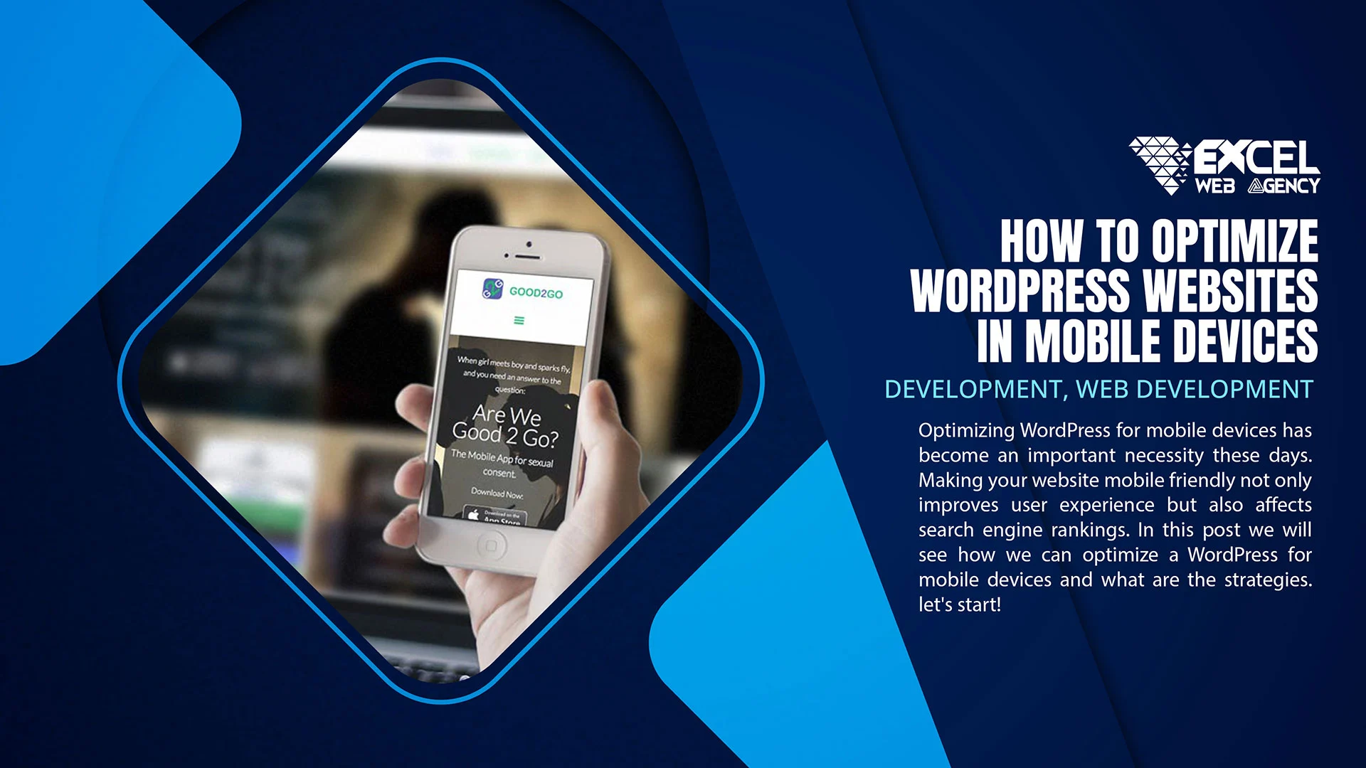
Read Also:
How to Optimize WordPress for Mobile Devices
Custom WordPress Website Development for Business Growth
Consistent Navigation Elements
It is important for your website’s navigation system to be simple and self-contained so that visitors can easily find where they are. Here are some tips that may help you:
Information About All Pages:
- The layout and style of the menu should be the same on every page of your website.
- Every page should have some navigation bar arrangement so that users can easily understand the menu.
Using Identical Labels:
- Made navigation labels look more uniform. If you call something ‘services’, it’s better to use ‘services’ everywhere.
- To avoid confusing labels, use short and clear labels.
Footer Navigation And Its Importance:
- Footer is also an important part of your website, so you should include important links there as well.
- Include contact information, privacy policy, and other important links in the footer so it’s easy for users to find them.
Advantages of Consistency in Navigation:
- Users will understand your website faster if your website navigation is consistent.
- Continuous navigation will make it easy for users to return to your website.
Call to Action (CTA) Placement:
- CTA buttons must be persistent. If you want to call your users to an action, CTA buttons should be positioned like this.
- Color the CTA buttons so that they are easily distinguishable from other buttons.
Continuous navigation will make your customers feel comfortable on your website, and they will easily find what they need. In addition, it will also maintain your brand recognition. So, make your navigation elements consistent and user-friendly.
Call-to-Action (CTA) Placement:
Amazing CTA On Homepage:
- Place your most important call to action (CTA) prominently on your homepage, so users know what you want from them.
- Example: “Sign Up Crane Now,” “Shuro Crane,” or “Hello Subscribe Crane Today.”
CTA by Location:
- Place a CTA on every page related to our page content. If someone is reading the blog post, add a relevant CTA.
- Example: “More Downloads,” “Free Trial Crane,” or “Download Now Crane.”
CTA Displayed After Scrolling:
- Use a dynamic CTA that engages users while scrolling.
- Example: “Make your vacation” or “Special offer just for you.”
Exit Intent CTA:
- When a user tries to exit the website, show an exit intent CTA to stop them.
- Example: “Wait! Special offer is coming,” or “Don’t miss me – subscribe now.”
Mobile Friendly CTA:
- Make it easy for mobile users to click CTA buttons too, so that they don’t face any problem.
- Example: expose buttons and use clear labels.
The purpose of CTA placement is to guide users to your website, so they can easily reach your goals. The design and text of every CTA should attract the user and encourage him to take action. This way, you can easily connect with your audience and keep them on your website.
Read Also:
Content Marketing in Financial Services: The Road to Success
How To Start A Digital Marketing Agency With No Experience
Search Functionality:
Featured Search Bar:
- Add a visual search bar to your website to make it easier for users to see.
- Place the search bar on the homepage, header, or navigation menu.
Autofill And Drinks:
- Add auto-complete feature and tips to search bar, so users can easily complete their queries.
- Example: When you type something, it automatically shows popular and popular search terms.
Dedicated Search Results Page:
- There is a special search results page, which can display the information found by users.
- Use thumbnail images with relevant results.
Clear Search Button:
- Make the search button easy to identify so users can find it easily.
- Example: Use a bright color or special icon.
Filter Options:
- If you have multiple searches on your website, it will help to provide options to filter the search results.
- Example: Use filters by date, category, or relevance.
With properly defined search functionality, you allow users to easily navigate your website. A better search system allows users to quickly access the information they need and thus improves the user experience of your website. So, make the search functionality user-friendly so that visitors can easily find what they are looking for.
Minimizing Clutter and Distractions
It is important to design your website in a simple way so that users can easily find the necessary information and do not face any problem. Here are some tips that can help reduce clutter and distraction:
Easy and Clean Layout:
The layout of your website should be simple and clean so that users can easily find the information they want.
Avoid too many colors and complex design elements.
How To Highlight Important Links:
Highlight important links so that users can see them easily and reach them quickly.
Must include necessary links in header and footer.
I don’t want to eat popups:
Minimize the use of pop-ups, especially when the user visits the website or is on a specific page.
If the use of pop-ups is necessary, design them in such a way that they do not disturb the user experience.
Use of Related Images:
Use only necessary and relevant images. Using too many images can create clutter.
Add Alt text to each image so that even visually impaired users can find the information.
Limited and Essential Text:
Include only essential information on each page and avoid long paragraphs.
Use short and clear sentences, which will be easy for users to understand.
Focus On Home Page:
Give more attention to your important messages and services on the home page.
On the main page, make the basic CTA (call to action) stand out.
Consistent Font And Color Scheme:
Use a consistent font and color scheme so that the overall look of the website is consistent.
The text is easy to read and easy to understand.
By reducing clutter, you can keep users comfortable and focused on your website. When you protect your customers from distractions, they stay focused on your services and information, thus delivering your message better.
Accessibility Considerations
While designing your website it is important that you also consider accessibility so that people can use your website without any difficulty. Here are some tips that may help you:
Inclusive Design:
- Build your website according to the principles of inclusive design, so that everyone can use it seamlessly.
- Take care of font size and color contrasts to make the text easy to read.
Keyboard Navigation And Screen Reader Compatibility:
- Simplify keyboard navigation so you can easily navigate your website without logging in and without using a mouse.
- Optimize the website for screen readers. Add alt text to images and use clean and proper HTML tags.
Text Legibility Aur Contrast:
- Check the rationality of the text. Use appropriate font size and spacing so that text is easy to read.
- Consider the right contrast between text and background so that it is not difficult for visually impaired users.
Subheadings and Descriptions of Multimedia Elements:
- Add subtitles and descriptions for videos and audio files to make content easier to understand for deaf or hard-of-hearing users.
- Provide a text-based alternative to accommodate any multimedia element.
Forms and Interactive Elements:
- Forms and any interactive elements are simplified so that users have no difficulty understanding them.
- Error messages should be clearly indicated so users know what the problem is.
Responsive Design:
- Build your website with a responsive design so that it can be viewed and used correctly on different devices.
- Consider accessibility for mobile users as well.
Taking care of the layout makes your website friendly to all types of users. Not only does it broaden your customer base, but it also represents an ethical and holistic approach. This way, you build a better relationship with your audience and make your website accessible to everyone.
Conclusion
Today we looked at some of the best tips and tricks to implement on your website. From making website navigation clean and simple, to responsive design and accessibility, there’s a surefire way to improve everything.
From performance optimization to user feedback, testing and improvement is essential at every step. You can improve your website through A/B testing and usability testing, while user feedback surveys and social media interactions help you understand your audience’s needs.
Minimizing clutter, maintaining accurate navigation and taking care of accessibility are critical to this journey. By combining all these factors, you can create a user-friendly, fast and comprehensive website.
Remember that a website is a dynamic entity and must be updated on a regular basis. By keeping analytics and user feedback in mind, you can always improve your website. This way, you can not only keep your customers happy, but also get ahead of your competitors.
Finally, always remember that the purpose of your website is to provide useful information to the user. If you understand customers’ needs and expectations, you can provide them with a better service and experience. And when your audience is happy, your website automatically improves too.